When you have an online store, your website is your biggest asset. A good conversion rate for an eCommerce store is just 2-3%. That means for every 100 visitors to your website 2-3 people purchase. By increasing your website conversion rate by just a fraction of a percent it can make a huge increase to your bottom line.
Selling online can be harder than selling in a brick an mortar store because you lose a lot of senses. There is no friendly welcome from your staff, no way for them to touch and feel the goods, no way to try things on and make sure they fit or test them, no shop assistant to build instant rapport with.
There are some key elements you need to have in place on your eCommerce store to overcome these barriers and create a positive shopping experience for your website visitors.
1. Design for mobile first
There is nothing more frustrating than visiting a website on my mobile and having to zoom in and squint and battle the site to find the menu!
It used to be that all websites were built for desktop and then some people started to make them responsive as mobiles got popular. A responsive website means the site adapts to the screen size it is on, whether it be a tablet, laptop or phone.
These days however eCommerce websites get the majority of their traffic from mobile devices, yet, people still design for Desktop first.
So get out your mobile phone, if you’re not already on it, and check what your site looks like on mobile, browse your products, add to cart and even make a purchase – is it a nice experience? If not you need to make some changes.
A website built for mobile first will not just size for the screen but be designed for it. The experience will be seamless and unnecessary desktop elements removed.
2. Showcase Shipping & Returns
When you’re shopping online there are a few things you want to know, how much will it cost you including shipping costs and what do you do if it’s not quite right?
Shipping costs are a big part of selling online. You have a few options when it comes to charging shipping – charge by order based on weight, location etc, charge a flat rate shipping cost or provide free shipping.
Shipping costs are the biggest barrier to making a sale online. Most people would rather buy something for $40 with free shipping than for $35 with a $5 shipping fee! They feel they are getting a product valued at $40 for $40 rather than a product valued at $35 for $40. It is all about perceived value.
With this in mind, you can choose to increase your costs to cover shipping costs. If you’re an online-only store or you can wear the cost of shipping as an expense of selling online, think of it as your rent, power etc that you are not paying. If you can’t offer free shipping on all orders, offer free shipping over a certain order amount. This can also help to increase your average order value.
If you are going to charge under a certain amount a flat rate fee is much easier as a consumer so if you can go with this option, you may lose on some orders and win on others.
The most important thing is to make your shipping fee obvious on every page. Consider a header banner showcasing your shipping cost and promoting any free shipping offers. People shouldn’t have to search your website for the shipping fee. If you feel you need to hide it, it’s too expensive.
Another objection you need to overcome is what to do if the product is not right. You should 100% be offering a guarantee on your products. If you are not confident enough in your products to offer one then why should people be confident enough in them to buy them? So instead of making your returns policy hidden at the bottom somewhere use it as a selling point and showcase your returns policy on each product page. This adds a lot of integrity to your site and gives people confidence to buy knowing they’re not stuck with something if it’s not right.
3. Generate Social Proof
When there are lots of people in a store browsing you instantly get the feeling that the store is popular and it makes you feel comfortable about buying there. It’s like when you’re at a market and there are lots of people at a particular stall, you instantly want to know what they’re selling!
When you’re browsing online you can’t see the other people sitting on their phones browsing the same store, you don’t know if anyone has bought from the store before, if they did, did they receive their item? There’s an element of risk when shopping online and it’s your job to make people feel comfortable ordering from your store, you need to put their mind at ease with social proof.
There are a few ways to add this social proof:
Install a review app and encourage customers to review your products once they have received them
Share your Instagram feed on your site with photos of customers using your products
Install a Recent Sales Notification app which shows when someone else is viewing a product or has just made a purchase. Try Sales Pop for Shopify or Proven for WordPress.
Link to your social media profiles
Use testimonials – video testimonials work best!
4. Kill The Pop Ups
The debate over to pop up, or not to pop up, is usually decided with the store in mind. Pro pop up argue that they receive so many emails from it so they keep it. I wonder though, do they measure how many people they lose who are just dam annoyed when they find this nice website, go to browse and then BOOM are interrupted by a pop up wanting their email. It’s like asking someone on a date before you’ve even said hello.
If you can’t tell I’m anti pop up, but I’m not the only one, Google now penalises websites which use automatic popups by lowering their organic ranking. So if you love that free Google traffic, it’s time to lose the pop up once and for all.
If you do decide to keep your pop up, be sure to have it on a timer so it only pops up after they have scrolled your site for a while.
5. Embrace The Need For Speed
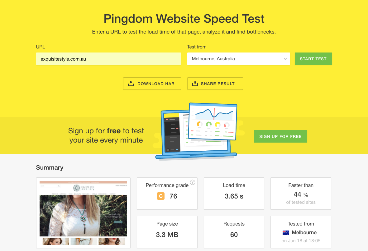
No one likes waiting – waiting at traffic lights, waiting in line or waiting for a website to load. Ideally, your website should load in under 3 seconds. If you’re not sure how long your site takes test it at https://tools.pingdom.com/.
This handy, free tool will tell you how long your site takes to load, as well as suggestions on how to improve your website’s load time. If you have a web developer get them to work their way through the list to make your site as quick as possible. If you have lots of large images on your website you may need to compress them to reduce the page size.
You can use https://tinyjpg.com to compress your images before you upload them.
6. Make Purchasing Easy
When you have an online store you want your users to make a purchase, so make it nice and easy for them. Use a bright call to action colour that stands out from everything else for your Add To Cart or Purchase buttons.
Once a user has added to cart make it a nice streamline process from cart to checkout:
Once they add to cart either take them directly to the cart or clearly display the cart on screen in a sidebar
Ensure if they continue shopping they can easily access their cart at any time, from any page
Make it easy to add or remove items from their cart
Make items clear in the cart including sizing and quantity
Allow them to proceed to payment without jumping through hoops
Allow them to check out as a guest
Integrate your shopping cart with Facebook Messenger so people can receive updates via Messenger
Ensure you have a secure checkout using Https://
7. Use Great Product Images
Without the option to pick up your products, touch and feel them, your website visitors rely on your images to make their purchasing decision.
Your photos should be one of your biggest focuses when building your online store. The perception is crappy photos = crappy product, quality photos = quality product.
Here are some things to consider:
Invest in good quality photos, either use a photographer or invest in a good set up if you will be taking your own photos regularly
If you are taking your own photos invest in training
Feature both lifestyle photos and product photos
Use multiple photos of each product at different angles
Consider using product videos, especially for clothing
Allow people to zoom in on photos
Add personality to your images
8. Value Your Product Descriptions
Your product descriptions are so important, yet sometimes given how time consuming it can be to write product descriptions for all your products they tend to start off great then end up short and sharp.
When writing your product descriptions imagine the person has found your product for the first time. You need to replace their missing senses, tell them what it is made of, what the quality is like, why it is unique. The photos along with the description are going to decide whether or not they want to buy.
Be sure to:
Write with your target market in mind
Describe the benefits of purchasing the product
Use emotion, how will the product make them feel
Include the product specifications, including material, size etc
Re-iterate things like Australian Made, Free Shipping etc
Brake up long descriptions with headings and dot points
Use an easy to read font size
Suggest other products that go together
Use a consistent voice across your website, don’t be afraid to include personality!
9. Make Things Easy To Find
When you’re shopping in a department store there is usually a clear map showing which floor everything is on and you can walk straight in, find the right level and make your way there. When browsing your website it should be just as easy.
Make menu items easy to find and read
Break things up into categories such as Mens, Womens, Kids, Babies
Avoid menu overwhelm – you don’t have to include everything in the top level menu
Use filters such as price, colour, size and category to make it easy for people to find what they are looking for
Show related products – this can also increase order value
Use menu breadcrumbs so people know where they are and how they got there
10. Re-target Using Facebook Ads
Just because someone abandons their cart doesn’t mean they didn’t want to buy your product. On average 68% of eCommerce carts are abandoned. Sometimes people get busy, need time to think about their purchase or wait for pay day.
Quite often though during the time they added to cart and when they have the time – or the money that have forgotten about you.
This is where re-targeting comes in. Using Facebook’s dynamic product ads you can show them reminder ads showcasing the exact product/s they had in their cart. This drastically decreases cart abandonment rates.
Unlike email marketing, Facebook ads don’t require the user to provide their email or have an account for you to be able to target them. This one thing alone could drastically increase your website conversion rate.
Don’t be afraid to use this in conjunction with a cart abandonment email, email and Facebook marketing work great together!
Take a look at your average conversion rate for the last 12 months and make a goal for the next 3 months. Implement some changes based on the above and then check your conversion rate again in 3 months time and see how you’re going.
Oh sh*t this page doesn’t exist!
Our tech may have blundered but to be honest, it’s likely a human error (yep, my company is run by humans).
You may be able to find what you’re looking for with the links below.
Or send me an email and a real person will get back to you.
Corine Raymond submitted a question for me to answer on the podcast “Is it a waste of money to pay a fee of $4k to show you the ropes of Ecommerce, a training course”.
Karyn (“with a Y!”) is an eCommerce marketing specialist with a knack for high-converting Facebook ad funnels and website optimisation. Through her eCommerce marketing agency and on-the-pulse training programs, Karyn’s helped hundreds of eCommerce store owners across the globe boost profits, generate more revenue, and achieve an ad-spend ROI of their dreams.