I know a lot of people track their website visitors – some are even guilty of watching them live through their analytics and get excited when someone jumps on only to be disappointed as they leave without buying again.
As tempting as it may be I don’t recommend this type of tracking as it’s not a productive use of your time!
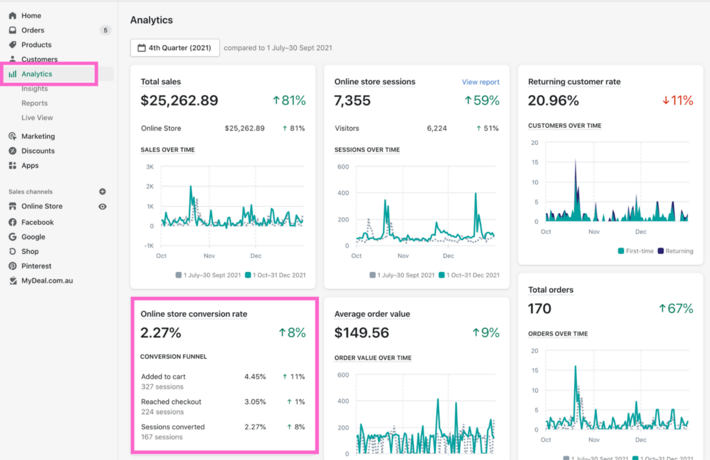
The percentage of people who check out when visiting your website is called your conversion rate. So if for every 100 people who visit your website, one person buys you have a 1% conversion rate.
A good conversion rate, and one I get our students to aim for is 3%. I’ve seen websites convert much higher, which is awesome, but 3% is a great place to be to have a profitable eCommerce store.
I recommend you hit at least 2-3% conversion rate before you focus on driving traffic to your website, and definitely before you spend money on paid ads.
There is no point in spending money to drive traffic to a website that is not converting.
The only exception to this rule is if you’re wanting to collect data, perhaps you have a new store, or you’ve just made some major changes and you want to find out where your conversion rate is now.
Then it’s OK to run ads, but have data as the main reason for your ads, not sales.
Now your conversion rate might fluctuate a bit, especially during promotions – you should find your conversion rate goes up. Katrinia from Bask and Bloom sees a consistent conversion rate of 4% which is excellent, but during peak promotions, this gets as high as 10%!
If you’re not sure what your conversion rate is you can check your analytics either in your Analytics dashboard if you’re using Shopify, or on Google Analytics which you should definitely be using!
OK so now that you’re tracking your conversion rate let’s talk about why it’s such a big deal.
If you get the exact same amount of traffic, your average order value – or the amount people are spending stays the same but you just increase your conversion rate, you’ll make more money – pretty cool right?
So if you currently get 1,000 visitors per month and have an average order value of say $100 and a conversion rate of 1% you’ll make $1,000 a month. If you up your conversion rate to 2% you’ll double your revenue to $2,000 – get it to 3% and you guessed it, your revenue goes up to $3,000 a month.
Do this with a website that gets 10,000 visitors a month and you can take your revenue from $10,000 to $30,000 a month just by increasing your conversion rate from 1%-3%.
Tripling your revenue without spending money of extra traffic – sounds pretty good right?
OK OK so now that you’re convinced that your conversion rate is suuuuper important, let’s talk about how to increase it.
Firstly you want to make using your website a nice, easy experience for your customers.
There are several ways you can do this.
Build For Mobile
First make sure your website is built for mobile – the majority of your website visitors will be viewing on mobile, yet we still see people building their site for desktop and then hoping it looks OK on mobile.
You can actually look at your Google Analytics stats and see firstly how much of your traffic is on mobile, and secondly your conversion rate on mobile compared with your conversion rate on desktop. This can be quite an eye opening experience.
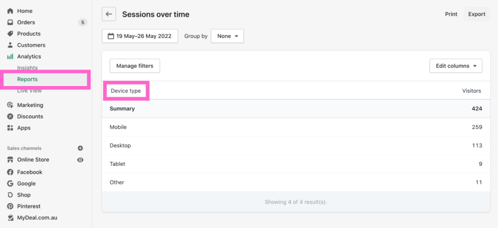
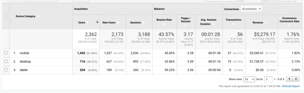
You’ll see above that this store gets over 60% of its traffic from mobile, however, the conversion rate on mobile is only 1.82% compared with 2.13% on desktop. If we get the mobile converting as high as the desktop it will mean extra revenue without any extra traffic.
Optimise Your Menu
Next we want to make it super easy to navigate and find what they are looking for. Optimise your menu to help them find your products – instead of the default home, shop, about, contact use your menu to showcase your categories like tops, bottoms, dresses or rings, earrings, bracelets and necklaces.
For Dignity does a beautiful job of this.
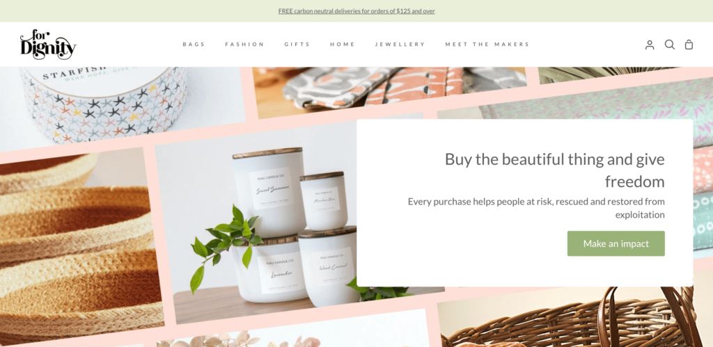
As with all changes you want to use data to make these decisions, so look at your Analytics and see which pages people shop by. Do they go by men, women, kids, or tops, bottoms, dresses? If you’re not sure change it to one way and then look at your stats after a month to see if people are moving through your categories how you thought they would.
A cool tool you can install is a heat map tracker. This tracks how people use your website and shows you where most people scroll and where they click. You may be surprised how people use your website compared to how you think they do.
As we always say here at Unstoppable “Until you test, it’s just a guess”.
If you have a lot of products you can make finding the perfect purchase easier by using filters in your category sidebars.
The 3 Second Test
You want to make it quick and easy for your visitors to know that they are in fact in the right place when they land on your website.
To do this we ensure it passes the 3 second test. What’s that I hear you ask?
The three second test is a quick and easy test you can do to see if your website is doing it’s job.
Show someone your website for just 3 seconds, no scrolling just 3 seconds on your home page above the fold.
Then after 3 seconds ask them 2 questions: What do you think I sell? Who do you think it’s for?
Then if they get it right, you pass and if they don’t you have some work to do.
Now don’t go asking your mum, your sister and your favourite aunty – ask people who you haven’t told all about your business. If the local butcher is not keen you can jump in my free Facebook group – Unstoppable eCommerce Entrepreneurs and post a screenshot to get some fresh eyes to do the test for you.
Your home page should clearly showcase your products and your target audience with one clear hero image – not a slider.
You want a heading and sub heading that sums up exactly what you sell and who it’s for.
“New Collection out now” is not helpful as some people are coming to your website for the very first time, if they don’t know what you sell what good is it to them to know your new collection is out? You can promote that to your warm audience – shout it from the rooftops on socials and definitely send it out in your emails – just not your home page hero image.
See how these headings tell you exactly what it is that they sell. They all get bonus points for ditching the default and using custom call to action buttons.
Think Fast
Another huge thing that will impact the user experience is the speed of your website.
You want your site to load in under 5 seconds, 3 is optimal. People are so time-poor and always in a rush, they are not going to sit and wait for your site to load. Use the Google speed test to see how long your website takes to load. Be sure to check the speed on desktop and mobile.
If your site is running slow look at compressing your images to make them smaller and therefore quicker to load. Also delete any plugins or apps you’re not using as each one will slow down your site.
If your website is terribly slow and you can’t get it down, look at using a new platform such as Shopify which is designed specifically for eCommerce with speed in mind.
It’s all about Trust
Now you’ve optimised your website to make it easy for customers to use we need to answer one big question for them – why you? Why should they buy from you? What makes you different? Why should they trust you?
Now it’s important to remember people buy from people. So put yourself out there as the face behind the brand, don’t be scared to show your face and share your story. Gone are the days when you have to pretend to be big – people like shopping small and knowing where their money is going – who it is going to.
They would rather help you put food on the table for your family than help some bazillionaire buy another private jet!
This is why I encourage our Ignitor students to put themselves on the home page with a link to their full story. Share behind the scenes of their business on socials and don’t be afraid to let people in.
Not only do people want to buy from people, they also want to know they are not the first person to do so! They want to know that other people have bought from you, that they go their products and they loved them. This helps build trust and reassure them that they too will receive their products and that they will love them too.
To help build this trust be sure to have reviews on your product pages, your home page and your cart page. Reviews add lots of trust and are simple to set up with a plugin such as Yotpo or reviews.io. If you haven’t got a lot of reviews yet then just use brand reviews about your great customer service or fast shipping times and put them on all the product pages until you have more.
Even better than just showing written reviews is showing user generate content. This is photos or videos taken by your customers of them with your products. Photos and videos are far more believable than just words so user generated content is gold for your website and your socials and particularly on your product pages. You can encourage user generated content through a competition or set up a review app to ask for a photo when they leave a 5 star review.
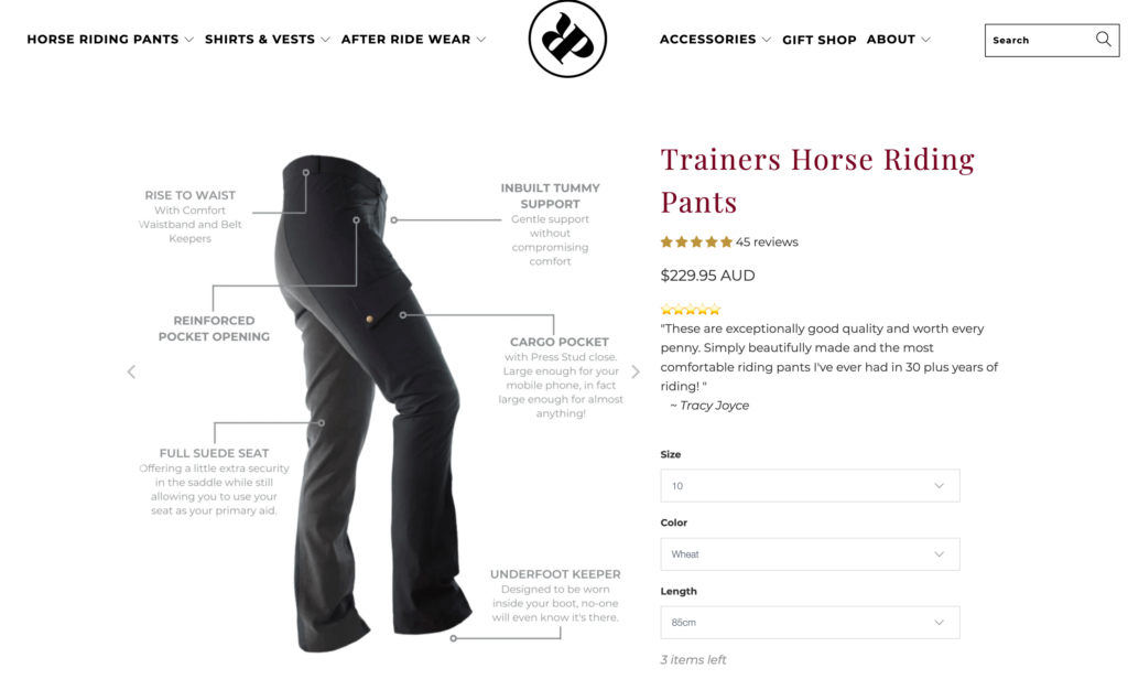
Ride Proud Clothing instantly add trust by showcasing these pants have had 45 five star reviews. Importantly, if you click the stars it takes you to the bottom of the page where you can see all those reviews. Make sure your reviews are genuine – making up reviews is a shore fast way to loose trust.
Visual icons are a great way to simply showcase key things about your business to add trust. I recommend using these on your home page and on your product pages. On your home page highlight 3-4 key things about your business such as handmade, made in Australia, made from the tears of unicorns! Whatever makes you special.
You can also use the icons on your product pages for things like vegan, cruelty-free, gluten-free if it’s food products and also to add trust around security like secure checkout.
Stand Behind your product
If you want people to trust you enough to buy your product then you need to trust your product enough to offer an awesome Guarantee. And when I say awesome I mean awesome for the customer, not for you!
You want to offer a simple returns policy. One of the biggest objections to shopping online for people is “what do I do if it doesn’t fit, or it’s not right.” If you can overcome that objection by backing your product with a great guarantee then you’ll find it will generate enough extra sales to cover the odd return – this is of course as long as you have a great product.
Offer Free Shipping
The other big objection to people shopping online, one that can really affect your conversion rate is your Shipping charge.
Now this is a big one and I recommend you read Should I Offer Free Shipping?
If you’ve ticked off everything else in this list and haven’t seen an increase in your conversion rate it may be necessary to look at your shipping fee and see if you can lower it, or at least offer a free shipping threshold.
So there you have 7 ways you can increase your conversion rate to turn those visitors into customers. Which one will you implement first?

